When explaining graphs in a thesis and research paper, it is essential to provide a clear and concise interpretation of the data represented in the graph. In this article, iLovePhD presented you with an effective guide to explain graphs in the thesis and research paper.
Effective Guide to Explaining Graphs in Thesis and Research Papers: Tips and Tools
Title and Caption: Begin by providing a clear title for the graph that summarizes its main purpose or finding. Follow it with a descriptive caption that highlights the key elements and trends depicted in the graph. Make sure the caption provides sufficient context and explains any abbreviations or symbols used.
Introduce the graph: In the text preceding the graph, provide a brief introduction to the topic or research question being addressed. Explain why the graph is relevant and how it contributes to answering the research question or supporting the thesis. This helps readers understand the purpose of the graph before delving into its details.
Describe the axes and variables: Clearly identify and label the axes of the graph. Explain what each axis represents and the units of measurement involved. Additionally, define the variables or data points represented on the graph.
Data Points: Draw attention to significant data points or noteworthy features of the graph, such as peaks, troughs, or sudden changes. Describe these points in the context of the research question or thesis statement. Explain any anomalies or unexpected trends observed in the graph.
Highlight trends or patterns: Analyze the graph and identify any significant trends, patterns, or relationships that can be observed. Explain whether the data shows an increase, decrease, fluctuation, or any other notable pattern. Use comparative language (e.g., “higher than,” “lower than,” “increasing,” and “decreasing”) to highlight these patterns and their significance. Use specific data points or numerical values from the graph to support your analysis.
Statistical Analysis: If applicable, provide statistical analysis of the data presented in the graph. Mention the statistical methods used, such as means, standard deviations, or significance tests. This adds rigor to your explanation and reinforces the credibility of your findings.
Provide supporting evidence: Whenever possible, supplement your explanations with additional evidence or information from your research or other sources. This can help to validate the patterns or trends observed in the graph and strengthen your thesis argument.
Interpret the implications: Discuss the implications and significance of the observed trends or patterns. Explain why these findings are important and how they contribute to your overall thesis or research question. Connect the information presented in the graph to the broader context of your study.
Limitations and Uncertainties: Acknowledge any limitations or uncertainties associated with the graph or the data it represents. Discuss potential sources of error, sample size issues, or confounding factors that may have influenced the results. This demonstrates a thoughtful analysis and helps readers understand the scope and reliability of the findings.
Relate to other parts of your thesis: Consider how the graph aligns with other information or analyses presented in your thesis. Highlight any connections between the graph and previous findings, literature reviews, or theoretical frameworks. This will help to create a cohesive narrative and reinforce the validity of your conclusions.
Use clear and concise language: Write your explanations in a clear and concise manner, avoiding jargon or complex language whenever possible. Aim to make your interpretation accessible to readers who may not have a specialized background in your field.
Include captions and references: Make sure to include a caption for each graph that provides a clear title and describes its content. Additionally, provide appropriate citations or references for the graph, following the citation style guidelines specified by your institution or field of study.
The specific approach to explaining graphs may vary depending on your discipline and the nature of your research. It’s crucial to strike a balance between providing enough information to understand the graph and avoiding excessive detail. Keep your explanations concise and focused on the most relevant aspects of the graph.
Learn how to effectively explain graphs in your thesis and research papers with our comprehensive guide. Discover key strategies for interpreting data, highlighting trends, providing statistical analysis, and relating graphs to your overall study. Explore popular online tools for creating professional visualizations. Improve the quality and clarity of your graphs to enhance the impact of your research.
10 Popular Online Tools for Representing Graphs:
When it comes to representing graphs in a thesis and research paper, there are several online tools available that can assist you in creating professional and visually appealing visualizations. Here are 10 popular online tools for representing graphs:
Plotly: Plotly provides a wide range of interactive and customizable graph types. It allows you to create visually stunning graphs with options for 2D and 3D representations, as well as animations.

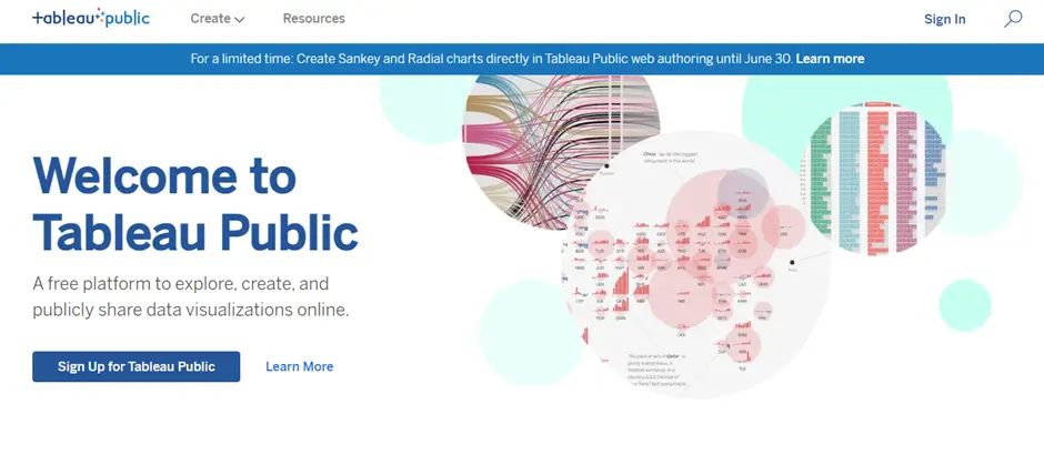
Tableau Public: Tableau Public is a powerful data visualization tool that allows you to create interactive graphs and dashboards. You can easily connect your data and create professional-looking visualizations.
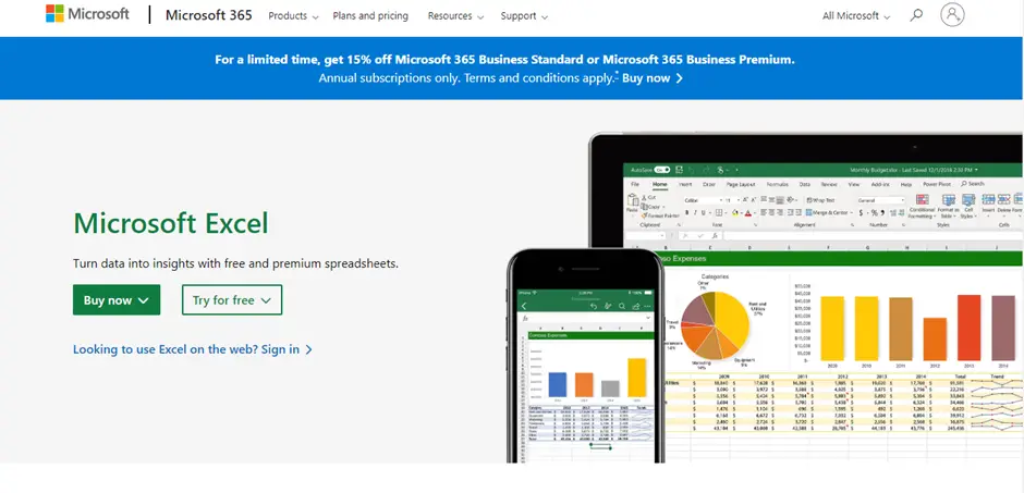
Microsoft Excel: Excel offers a range of graphing options and is widely used for data analysis and visualization. It provides a user-friendly interface for creating various types of charts, including bar graphs, line graphs, scatter plots, and more.
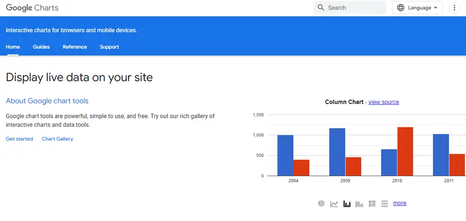
Google Charts: Google Charts is a free tool that enables you to create a wide variety of charts and graphs. It offers a simple and intuitive interface with options for customization and interactivity.
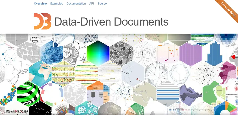
D3.js: D3.js is a JavaScript library that allows you to create dynamic and interactive data visualizations. It provides extensive flexibility and control over the design and behaviour of your graphs.
Infogram: Infogram is an easy-to-use tool that enables you to create infographics and data visualizations. It offers a range of graph types and templates to choose from, making it suitable for creating eye-catching visuals for your thesis.

Canva: Canva is a versatile design tool that includes graphing capabilities. It offers a wide range of templates and customization options, allowing you to create visually appealing graphs and charts.

Chart.js: Chart.js is a JavaScript library that provides a simple and responsive way to create static and interactive charts. It is lightweight and easy to implement, making it a popular choice for web-based visualizations.

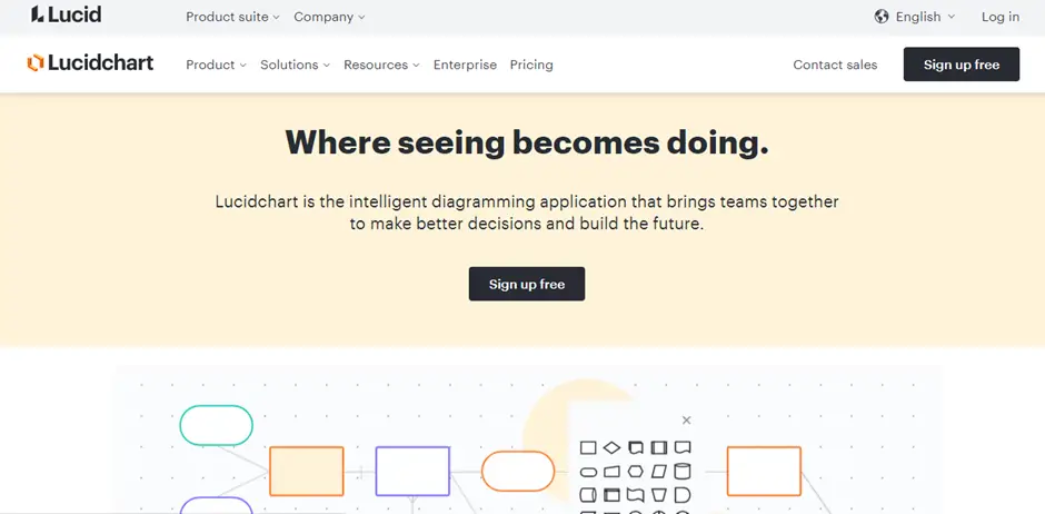
Lucidchart: Lucidchart is a web-based diagramming tool that can be used for creating various types of graphs and flowcharts. It offers a drag-and-drop interface and collaboration features, making it suitable for complex visualizations.
Adobe Illustrator: Adobe Illustrator is professional design software that allows you to create vector-based graphics, including graphs and charts. It provides advanced customization options and is ideal for creating intricate and detailed visualizations.

These tools offer a range of options for creating graphs and visualizations, catering to different skill levels and design requirements. Choose the tool that best suits your needs and familiarity with the software to effectively represent graphs in your thesis.

